I Love Fonts
Fonts are a very important part of my graphic design. It is one of the steps in my graphic design process that takes the most amount of time for me to decide upon. I search for new fonts all the time as there are always new fonts to discover and I’m always looking to innovate. They are so many website were you can download free fonts – I’m like a kid in a candy shop sometimes 😉 These are some of the websites I use myself:
1001 Free Fonts: 1001freefonts.com
Font Squirrel: fontsquirrel.com
Dafont: dafont.com
These websites have a great wide range of fonts that you can download for FREE, so it is time to stop using ARIAL for your designs. You can import the font sets into most programs on your computer so you can even spruce up your Word Docs too!
Why I Love Fonts
Anyway what I wanted to do was to show you some of my favorite FONTS – at least for right now…trends changes all the time 😉
I didn’t want to just list them for you, I wanted to show you how I used them so you can understand that every font has a style and that it needs to balance with the style of the illustration, graphic design or theme. For example for illustrations I use fonts with a more calligraphic style whereas for more clean design with photos I use fonts with clean lines.
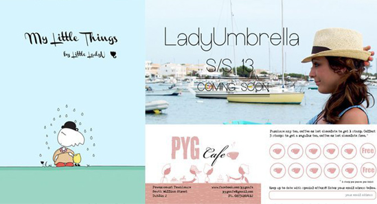
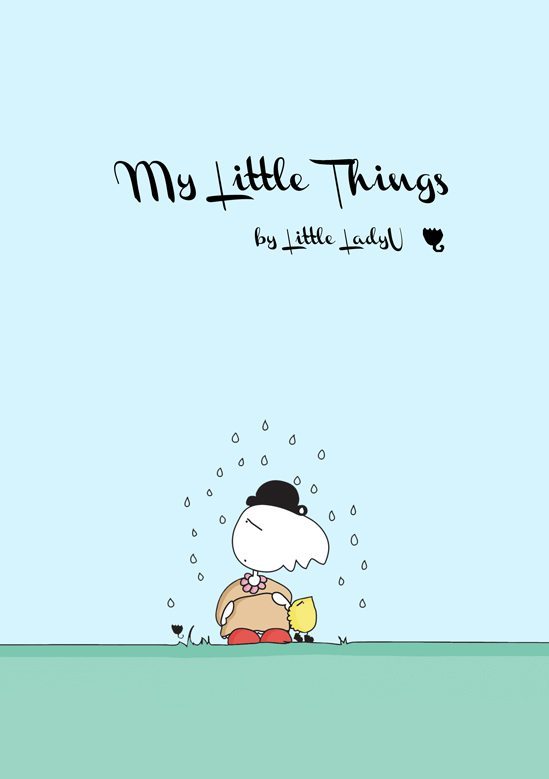
1. Channel Left-Slanted: This one is a lovely font that I used for one of the my last projects for LadyUmbrella. It is a very graphic font, almost like a drawing. Suitable for designs with illustrations, comics or drawings. I love this font and I will use it for Little LadyU illustrations but I won’t use it for anything else because I want people to identify the font with Little LadyU and with nothing else.
Why I Love Font II:
2. Type-Ra: This is a very classic Font or should I say “vintage” because it is a font that tries to simulate an old school typewriter and that is why I love this font so much. To be honest it is a font that I would like to use more often but it doesn’t work with everything. You need to be cautious when you use it.
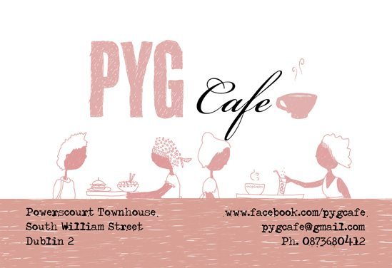
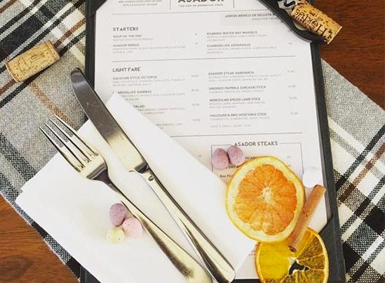
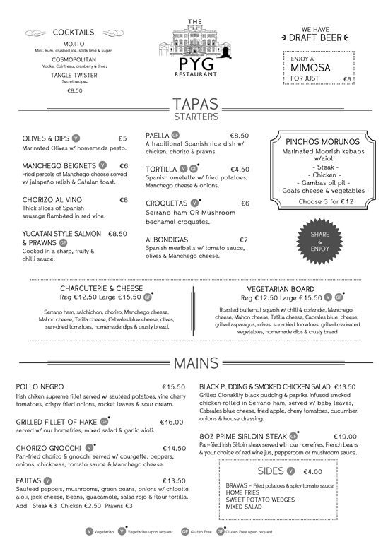
3. Whipsmart: I’ve been using this font for the last few months in so many projects that I can’t remember, but I wanted to show you at least one of the projects that I did for Pyg Restaurant with this font. It is a very easy font to use, very easy to read and clean lines. Perfect for menus, brochures, flyers, magazines – in general, graphic design where text is the main thing. Yes, I love this font.
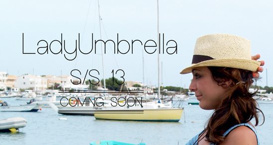
4. Europe Underground: So, what can I say about this font. You will probably recognize this font. I think a lot of designers are using it at the moment. It is clean but with few round shapes which is what I love about it. It is perfect for branding and I used it myself for my clothing company LadyUmbrella and my new collection that is coming soon. The only problem I found with this font is that you need to add a little stroke because is too thin and if you don’t add the stroke you can barely see it…but it is a problem with solution.
I Love Fonts
These are just a small example of my favorite fonts – I just wanted to give you an idea of the fonts that I’ve been using at the moment.
I hope it’s been useful for you and what I really want to know is what are your favorite fonts as well? Leave a comment and let me know so I can look them up 😀