Logo Design – The New LadyUmbrella Logo
LadyUmbrella was my first project as a graphic designer and fashion designer. It was in 2007 when I started drawing my first sketches of LadyUmbrella (a lady with an umbrella as a head) and did her logo design and I’ve been drawing her ever since.
The brand has been developed throughout the years and we tried with every collection to look ahead and introduce new styles and designs.
If you want to know more about LadyUmbrella in the past, please feel free to check the LadyUmbrella facebook page…and maybe you can leave us a comment as well 😀
LadyUmbrella is back!
LadyUmbrella was on a hiatus for more or less the for 2 years. We had a little break, but to be honest, this break helped me to see things a little bit more clearly about how I wanted to develop the brand and something that I realized that I needed to change about the branding was the LOGO design.
The brands new collections developed with simpler illustrations which were more abstract and minimalistic. The bright colors which were indicative of the brand when we launched the first few collections are still there but more refined. This change in brand direction is what prompted me to develop a new logo.
For the last few months I’ve been working on our Spring/Summer collection for the next year and came across a beautiful font (you know I love fonts right?) that I thought reflected the new LadyUmbrella.
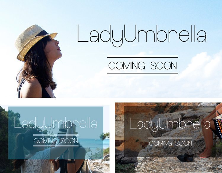
As you can see the font is clean and sharp but with some rounded shapes that aligns with the LadyUmbrella brand ideals of simplicity and naturalness.
Logo Design – The New LadyUmbrella Logo
From there, I started to developed the logo. I added two small illustrations: one of them is a twist on the old logo design (the umbrella graphic) and I introduced a new element, the drop of water, that sits beside the umbrella, to balance the design. The drop of waters shape – as you can see below – has been taken from the A from the logo as I was trying to find a better balance between all the elements.
![]()
…and after going back and forth couples of times, the logo become alive. I decided to use just 2 colors for the final logo, black and pale blue, and I made the thickness of the stroke on the font a bit bigger to make it clearer and more visible. Finally I attached the 2 little icons (drop of water and umbrella) below the font. As a I said I was always looking for simplicity and I think I found what I wanted to represent the New LadyUmbrella.
![]()
Less is More
With all logos I think is important that there is a smaller more minimalised small version of the main logo.This smaller logo, the evolution of which is pictured to the right, can be used throughout out all branding and eventually reconisable by itself.
All mayor brands hope to be recognised by smallest or just one element of their logo design and I hope that in time this blue drop and umbrella will stand alone by themselves to represent LU and LadyUmbrella.
As LadyUmbrella is where I started my graphic design work, it is great to approach the logo again, with the benefit of few years more experience and improve it (hopefully you agree??). Stay tuned for LadyUmbrella updates and you can check out more of my logo design projects here. If you’d like me to design a logo for you, then get in touch. 😉