Examples Of 3 Branding & Design Refreshes
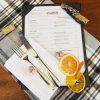
Menu Design
Not all projects are logo projects and that’s ok. Whilst it’s true that a lot of my project work is for full logo design and branding during any given week I could be working
brochures, logos, packaging, web design. Here are some recent projects that I’ve worked on to give you flavour of what is happening.
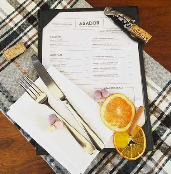
Client – Asador
Objective – The brief for the project was to upgrade their various menus to give them a more professional look and to provide them with the menus in a format that could be easily updated in house.
In total there were over 10 menus to update for lunch menu, a la carte, cocktail menu, wine list, terrace menu, dessert menu and a few special menus.
I gave the menus a more modern style and a cleaner look. The rustic style font used on the logo is used on the different menus to give a more balance look and the branding colour, burgundy, is also used on the menus (without being too overpowering). 1 or 2 sections of the menus are highlighted with ornamental touches or minimalist frames to catch the clients attention, such as the Cocktails or Asador Steaks sections.
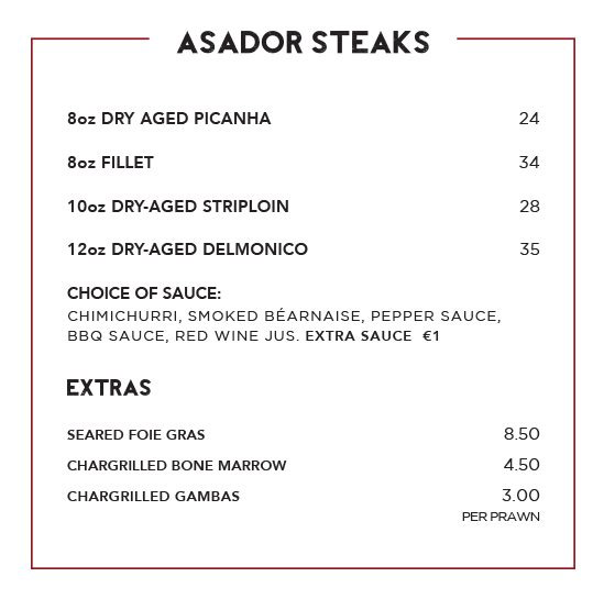
The files provided to the clients are editable and they can make small changes (.ie prices, ingredients…) anytime. Visit asador.ie to check their different menus.
Business Card & Flyer Design
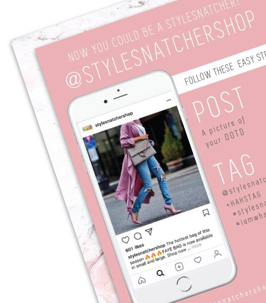
Client: Stylesnatcher
Objective: The client was looking to upgrade her branding, logo, business card, promotional flyers – the works! The client was looking for a new vibe for her company, a more minimal look. I don’t only design logos, I create a complete branding package with business cards, headed paper, social media suite and also packaging. This project was a bit of a 180 compared to the previous look and feel but I think it works!
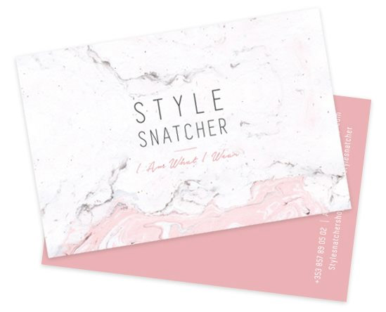
The business cards and flyer were designed to promote her instagram account. For the front of the business card and flyer I’ve used a marble pink texture matching the colours of the branding: soft pink and grey. For the back of the business card and flyer I’ve used the nice soft pink as the main colour so the info (in white) pops nicely.
Packaging Design
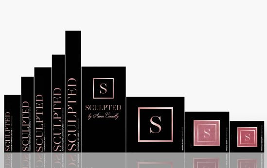
Client – Sculpted by Aimee Connolly
Objective – The client produces a make up product and the company is becoming very popular in Ireland due to the Aimee’s popularity on social media and growing profile. She needed an icon to be used in small packaging and where the whole logo won’t fit easily.
The idea was to create an icon that complements the logo so that’s why the same “S” from Sculpted was used so customers and clients can identify the packaging as being from Aimee straight away. The “S” is framed by a square frame so it’s easy to use separately.
![]()
A nice pink-chrome gradient colour was chosen for the icon and the same colour was added to the logo to balance the whole design. The image of the packaging below is a suggestion for her packaging where you can see how the logo and the icon work together or separately nicely.
If you need help with any upcoming projects – regardless of the scope – the get in touch by filling in the form here or e-mailing me at [email protected] or contact me here