OBPA
The logo for OBPA reflects professionalism and elegance with an abstract touch as a result of the icon.
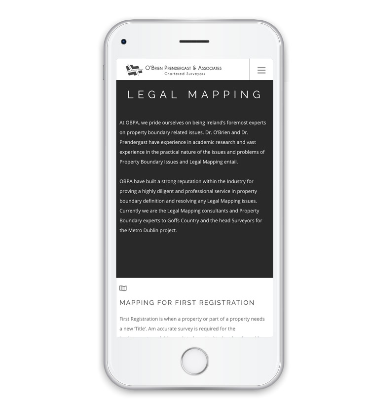
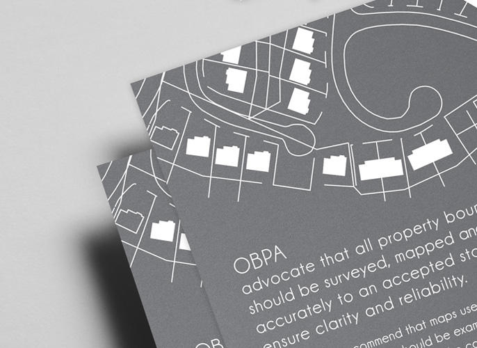
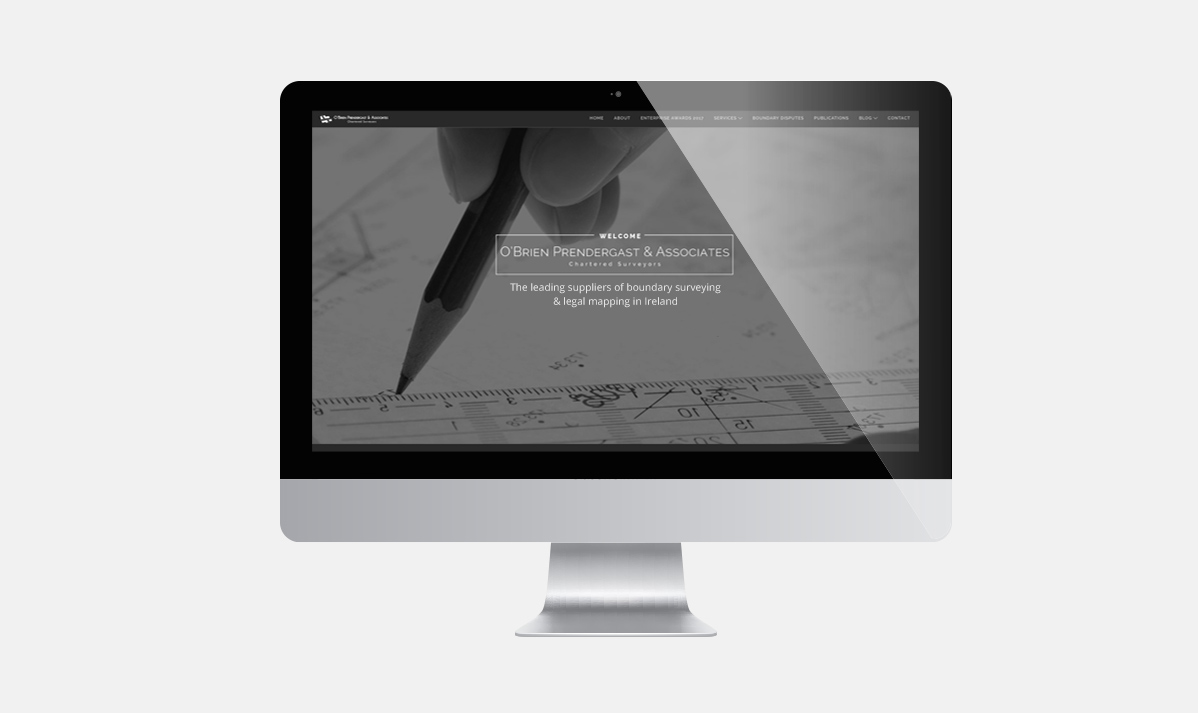
The colours used for the logo and also for the website are mainly grey and white, these colours always give a very professional and serious look to a company (something that was the first requirement from the client).
The logo, web design and bespoke icons were created to work together as a complimentary set that looked balanced whilst giving the brand the serious and professional look they were looking for. All the different graphics and photos used on the site were carefully chosen to create the perfect balance and design.
Profesional, efficient, visionary and brilliant! Elena design our company logo and helped design and mould our brand. Without Elena I could not be more prouder of our company, OBPA. Elena brought a vision and elegance we as a professional practice wanted to portray. Elena did that and more.
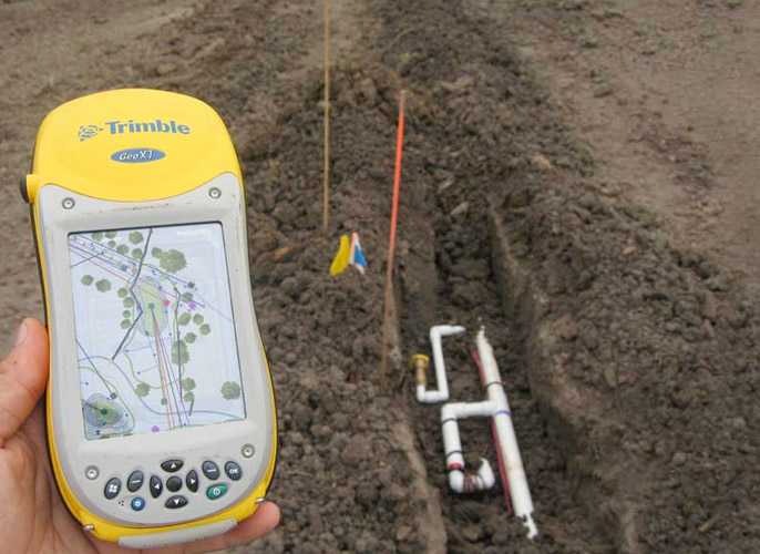
As a Legal Mapping and surveying practice, logos can be cumbersome and boring. With Elena’s background in fashion, I was extremely confident that we were hiring someone who knew what people who like and what would be visually impressive as a logo and brand. It has style, it is modern and will last the test of time. I have recommended Elena to a number of my clients and they are as impressed with her as I am. I have absolutely no hesitation in recommending Elena to anyone and I look forward to working with her in the future.
Daragh O’Brien
Surveyor & Legal Mapping at O’Brien Prendergast & Associates
Let's Work Together!
To avail of any of my logo and web design services and to get a free quote, contact me now!

